Have you ever had a favorite artist whose work inspires you to improve your own creative process? Or, maybe to investigate things you hadn't considered before? Mandy Pattullo is one of those inspiring people to me. I do not have her sketching skills, nor do I work with some of the materials she uses, but her love of old fabric and stitch and the dignity she gives in her transformations of these pieces is such a person.
For the month of January she began working with postage stamps, filling a sketchbook with paint, paper and cloth, and it made me think about my own box of postage stamps, collected over the years-- and how dwindling the availability of these stamps becomes as we e-mail more or send things through carriers rather than the postal service. I pulled out the packed-to-the-gills box and marveled at these little works of art, just as I had when I was ten years old. And if I was a cartoon, I would have had a little conversation bubble over my head with a lightbulb clicking on: Bingo!
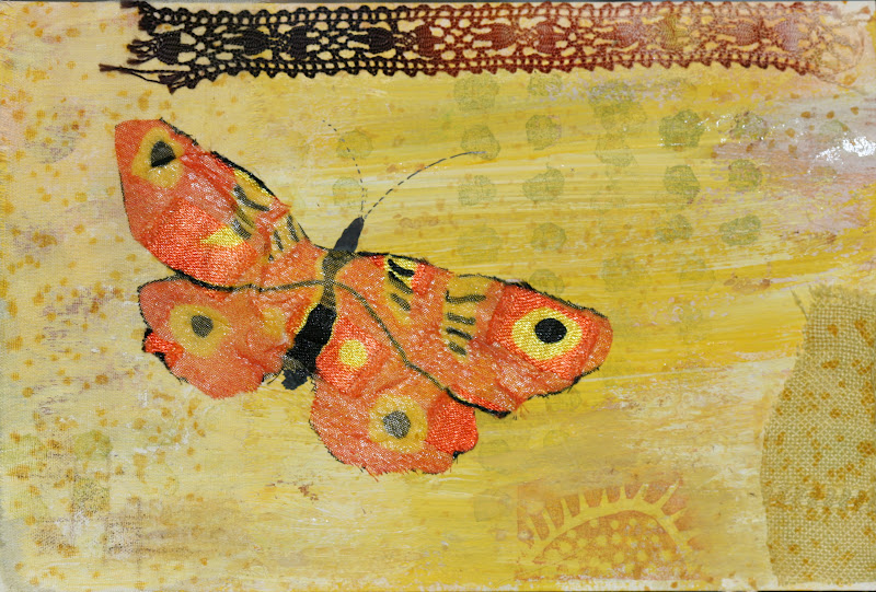
The Bingo Moment came when I realized that the diminutive size was perfect for the palm-sized fabric collages I was working on. I needed a focal point that had great detail to it, and it must be quite small. A piece of printed fabric was not to scale, and the pieces were too small to create easily-recognized images. And there were so many colors stored in those tiny bits of paper . . .
The pieces are built in my little fabric sandwich style, layered and stitched work that might be layers of hand-dyed pieces from old napkins and tablecloths, pieces of clothing, things left over from other projects-- even the threads were often re-cycled by over-dyeing when I had an abundance of one color or another. The edges might be finished or not, depending on the fabric itself. The unfinished edge is a way of giving immediacy to a piece, like a quick sketch from a vacation or a walk in the woods.
If you would like to see Mandy's work, her blog is here. Below are two of the pieces her postage stamp collages inspired me to create. Now that the gate has been unlatched, this may go on for a while . . . lots of stamps . . . tons of fabric scraps . . . long winter days ahead . . . ? ? ?
Thank you, Mandy!
Showing posts with label Mixed Media. Show all posts
Sunday, January 24, 2016
Wednesday, December 2, 2015
Topographies of the Mind
I had an idea about stitches suspended above a surface, and to this end I experimented with a block of wood, nails, wire of different gauges, strips of cloth, yarn of various sizes, a woven ribbon of some stiff, natural fiber, and a couple of tubes of blue and white acrylic paint.
The block of wood was a scrap of 2" x 6" lumber, painted in layers of blue, slightly distressed-looking. When it was dry, I planned paths across the surface and began to nail into it. With the nails in place, I used different materials, including picture hanging wire, to begin wrapping and stitching the posts. Before this, I would never have guessed that I could actually shape stitches with picture hanging wire.
The circular forms took shape as I connected the lines with stitch. After the stitching was finished I hammered the nails further into the block.
The result is akin to a topographic map, some of the hills quite tall and broad, others lower, more like islands in a stream.
When the call for entries came in August or September for a mixed media international exhibit sponsored by EGA, I was still working on this piece in fits and starts, so I set other things aside and began working to finish it in earnest. And two days ago, I got word that the piece had been accepted!
Now I have only to package and mail it to Louisville after the New Year for the photographing and set-up. The show runs between February 3 and July 15 of 2016.
Which is by way of saying that you just never know where curiosity will lead you, or what odd materials you might find for making stitches. Mixed Media, in the words (or near words) of Jean Littlejohn, is anything you want it to be.
Wednesday, October 21, 2015
More Blue Vases
The break from social media, blogs, Etsy shop-- I have seen how much energy goes into all these things. I plan to be very particular where I spend that energy in the future.
Through diligent shovelling in the boxes of past work, more pieces in the Blue Vase saga surfaced. To my amazement, I had missed them, scattered as they were amongst the several boxes of work stored under a table in the studio. If these pieces were plants, I would say they were self-sowing. That said, I have added to their numbers with two new pieces.
Here the Blue Vase (which seems to resemble a flower pot more than a vase, I was told at a recent FreeStyle meeting) is having a rough go of it. The flowers seem traumatized and are leaning and reaching and doing their best to be somewhere else. This is worked on a heavily-layered fabric ground.
In response to the frenetic escapism of the first piece, this Blue Vase is shown sans flowers, a much calmer little setting. This feels like a Joe Friday interrogation: "Just the facts, ma'm. Just the facts."
After looking at this for several weeks, I decided there was more to a blue vase than "just the facts." In little nibbles of time over several days, it became a little more decorative, and the background was free-motion machine stitched:
There was a time when I simply stitched flower pots and vases in all color combinations and the dreaded Demise Of The Blue Vase had not yet burst into my life. A long, long time ago. This is one of those Other Vase stitcheries. The fabric is a delicious piece of chartreuse linen, and the stitching is all the simplest of stitches-- there is even a flat satin stitch, which I rarely use anymore. It was stitched to brighten a small, dark corner of the place I lived at the time, when my son was quite small.
The newest is a mixed media interpretation of the Blue Vase. On Arches watercolor paper, with ink and watercolor ground, machine stitch, wire, acrylic paint (on the fabric), and hand stitch. The paper was given a momigami treatment, but I think 140 lb. watercolor paper might not be the best candidate for that process.
Of course, after some thought, this one needed a little more personality. Sequins, beads, a wire flower . . . Much improved, don't you think? The original was much too serious.
And there is yet another in progress! This is becoming the Season Of The Blue Vase(s). 6" x 6", or near that. That small-ish format remains my favorite. 12" x 12" is still a little scary. The next step is, of course, to gather up the unmounted pieces and have a great, long session with fabric and stapler and needle and thread and get them onto a substrate. Where are My People when I need them? In an effort to lessen the chores of studio life, I am thinking I should return to simply pinning the pieces to an open spot on a wall in the house. There is a small amount of that shrinking real estate available. In truth, I like that look of unframed, almost unplanned wall arrangements. After all, I am the one who needs to be entertained more than anyone else living here. One day some years hence, my son will be puttying up the nail and pin holes and selling the house. In advance, I apologize, Jordan. And I promise not to be too dramatic if you break anything in my house. Just a few tears, minimal whining . . .
Monday, February 23, 2015
Fine-Thread Stitching with Beads and Ultrasuede
Recently I needed to go through things to loan pieces for a small exhibition of work for a new FreeStyle group just taking root in Knoxville. When the box was returned, I found some small pieces to share.
These two 6" x 6" pieces were both done in the fall. The first, with the green background, was an exercise in tiny stitching and texture. Sometimes neat, tiny stitches do not have much textural interest. There are beads and Ultrasuede to help the textural considerations along. Most stitching is a single strand of floss, with some sewing machine cotton. I used Beading needles on both pieces.
Below is a design worked from a mark-making session with the FreeStylers. We experimented with different tools for making marks on paper with a water-based printer's ink, then chose a section of our mark-making to translate into a stitched design. There is charcoal, medium and light grey thread used for the stitching, along with Ultrasuede, Bugle Beads and antique glass buttons.
Both pieces were labors of love. We had been stitching for months with heavy yarns, and this lighter -weight stitch was a break in texture.
These two 6" x 6" pieces were both done in the fall. The first, with the green background, was an exercise in tiny stitching and texture. Sometimes neat, tiny stitches do not have much textural interest. There are beads and Ultrasuede to help the textural considerations along. Most stitching is a single strand of floss, with some sewing machine cotton. I used Beading needles on both pieces.
Both pieces were labors of love. We had been stitching for months with heavy yarns, and this lighter -weight stitch was a break in texture.
Tuesday, September 2, 2014
Water's Edge
This watercolor on canvas is combined with machine and hand stitch, appliqué, beads, stones, and a variety of very textured yarn. It is a look at the little bit of marsh and sea we enjoy in a family trip to the coast of Georgia every spring.
The views of the canvas from the side are interesting, too. The trip starts at the edge of the wall and turns the corner to the front of the canvas . . .
then continues on the right side-- as if the water's edge was too lovely to leave:
Friday, March 28, 2014
Blue Meadow
The cottage commands a sweeping view of hand-tinted vintage lace, bead and button flowers, and a curious blue and yellow-green river flowing beneath all. A blue orchard bearing vintage silver Japanese seed beads shares the horizon with the red-roof cottage I have always imagined to be the home of my Irish great-grandfather. This little story and its bright colors are set in a 6 1/2” rusticated wooden tray. I don’t know how I could manage the stresses of life without my drawers of vintage laces and trims, so using them in this little piece was therapeutic.
Monday, September 3, 2012
More Stories from the Studio
I decided to make a post card to send to my sister. She and I do this, periodically. Hers are beautiful little gems, painted carefully, professional-looking, and engaging. Mine are usually abstract, worked in layer after layer of paint and pencil and ink, the sort that make you scratch your head and turn the card several directions before settling into what must be the proper view.
I tried something different this time. After laying down an autumn-flavored ground, I added some texture. Linen. Silk. Cotton organza. Even a piece of painted lace insertion. When I walked around the corner of a table, I saw my little hole punch— the one that makes teeney weeney little holes. The exact size I would need to push a needle and thread through . . . hmmm . . . And right beside that, the rubber stamps I've been carving the past few weeks. Oh, heart be still!
The results are thus:
The first, a silk butterfly Jill sent over, which I found I could iron onto the watercolor postcard successfully (bless the inventor of heat-set bonding chemicals). And the scraps of vintage linen that I'd dyed years ago matched the fall look of things. The cotton organza is on the right. I stamped over it, and the texture is lovely! (Note: After I photographed the original, downloaded the photos, then onto the blog, I went back and added some stitching . . . Sorry. It's editing at its most obsessive, keeping at it until there is nothing more to add or subtract . . .?)
Next, I decided to add more mystery to the composition. More things going on, more places for the eye to come to rest-- and, of course, the hole punch and the stitching on the left-side. And a bit more texture than the first card. Not sure if the leather blocks at top will make it through the postal service, though. This one may get some more "editing" to keep the leather in place before it leaves the studio.
New idea altogether: After the initial layer of color, this third card has some pieces of linen and cotton trapped under some very sheer silk organza that was bonded to the card. Most of the designing was stamped or drawn into that piece of silk. The silk takes the ink differently, barely mutes the back, and adds a gorgeous feel to the postcard.
Finally, a last fling with the color of falling leaves. There are so many layers of work here that I would need a couple of paragraphs to list them all. The most fun is to continue working the branches outward, upward, curving down from the cut-off point of the stamp . . . each tree is a little different from its neighbor that way. This is a little Mark Chagall-ish
The next morning, I wanted to use blue. Deep, rich, roll-around-in-it Blue. First is the one I decided my sister would most relate to, since she spent the Labor Day weekend on the beach. This is a view of tidewater pools as seen from above, but with the additional vantage point of a bright door standing upright (doors are always wonderful ways to enter into mysterious worlds). I used a texture medium meant for water-based colors, mixed some pastels with the paints, and began laying down layers of color. The door has been painted separately and glued on, then popped into a book press to smash the door cut-out into the paper card better.
Next is a more modest look at blue. More tree stamping, extending the branches, drawing and painting and stamping over a lacy Japanese tissue paper (is is called endru, perhaps?) . . .
I'm not sure which is my favorite, but the process was exhilarating. And the stories that could be told from the mysteries in the cards ... ooo, la la!
Subscribe to:
Posts (Atom)