I tried something different this time. After laying down an autumn-flavored ground, I added some texture. Linen. Silk. Cotton organza. Even a piece of painted lace insertion. When I walked around the corner of a table, I saw my little hole punch— the one that makes teeney weeney little holes. The exact size I would need to push a needle and thread through . . . hmmm . . . And right beside that, the rubber stamps I've been carving the past few weeks. Oh, heart be still!
The results are thus:
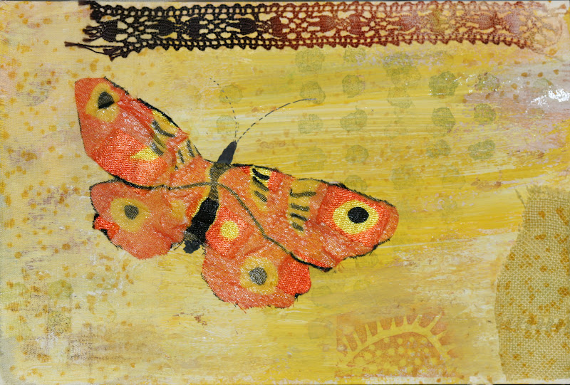
The first, a silk butterfly Jill sent over, which I found I could iron onto the watercolor postcard successfully (bless the inventor of heat-set bonding chemicals). And the scraps of vintage linen that I'd dyed years ago matched the fall look of things. The cotton organza is on the right. I stamped over it, and the texture is lovely! (Note: After I photographed the original, downloaded the photos, then onto the blog, I went back and added some stitching . . . Sorry. It's editing at its most obsessive, keeping at it until there is nothing more to add or subtract . . .?)
Next, I decided to add more mystery to the composition. More things going on, more places for the eye to come to rest-- and, of course, the hole punch and the stitching on the left-side. And a bit more texture than the first card. Not sure if the leather blocks at top will make it through the postal service, though. This one may get some more "editing" to keep the leather in place before it leaves the studio.

New idea altogether: After the initial layer of color, this third card has some pieces of linen and cotton trapped under some very sheer silk organza that was bonded to the card. Most of the designing was stamped or drawn into that piece of silk. The silk takes the ink differently, barely mutes the back, and adds a gorgeous feel to the postcard.

Finally, a last fling with the color of falling leaves. There are so many layers of work here that I would need a couple of paragraphs to list them all. The most fun is to continue working the branches outward, upward, curving down from the cut-off point of the stamp . . . each tree is a little different from its neighbor that way. This is a little Mark Chagall-ish

The next morning, I wanted to use blue. Deep, rich, roll-around-in-it Blue. First is the one I decided my sister would most relate to, since she spent the Labor Day weekend on the beach. This is a view of tidewater pools as seen from above, but with the additional vantage point of a bright door standing upright (doors are always wonderful ways to enter into mysterious worlds). I used a texture medium meant for water-based colors, mixed some pastels with the paints, and began laying down layers of color. The door has been painted separately and glued on, then popped into a book press to smash the door cut-out into the paper card better.

Next is a more modest look at blue. More tree stamping, extending the branches, drawing and painting and stamping over a lacy Japanese tissue paper (is is called endru, perhaps?) . . .

I'm not sure which is my favorite, but the process was exhilarating. And the stories that could be told from the mysteries in the cards ... ooo, la la!
No comments:
Post a Comment